Exploring the Emotional and Psychological Effects of EIFS Design Choices
| Top Takeaways | |
|---|---|
| Color and texture have an outsized influence on human psychology, mood, and behavior in designed environments. | |
| Research shows our brains instantly process and associate colors and textures with distinct emotions and meanings. | |
| EIFS provides immense flexibility to curate psychological experiences through color and texture exterior finishes. |
Introduction
Color and texture may seem like minor design details, but they have an outsized influence on human psychology and perception. The colors and textures used on building exteriors directly impact the mood and emotions of occupants and passersby. Recent research in neuroscience and psychology demonstrates that different hues and tactile qualities can elicit specific psychological and physiological responses.
For architects, builders, and homeowners, understanding the science behind color and texture is crucial for creating spaces that feel uplifting and inspiring. By strategically employing different colors and textures, it’s possible to craft environments that positively affect mental states. The thoughtful use of color and texture can turn a building into a work of art that transforms how people feel as they inhabit and interact with the space.
In this article, we will explore the remarkable influence of color and texture on mood, perception, and emotion. Examining key studies and real-world examples, we will uncover design principles that can help unlock the full expressive and psychological potential of building exteriors. From the calming effect of cool hues to the coziness of rough textures, color and texture have the power to shape our interior lives in surprising ways. By harnessing this knowledge, architects and builders can create one-of-a-kind spaces that feel intensely personal and soul-nourishing for those who experience them.
The Importance of Design Details
Recent studies demonstrate that subtle elements like color and texture have an outsized impact on psychological and emotional states. While they may seem minor, these details profoundly influence how spaces make occupants feel on a deep level.
How color and texture influence the brain
- Color and texture are processed in the brain’s limbic system, which regulates emotion and memory.
- The limbic system instantaneously elicits feelings and associations in response to colors and textures.
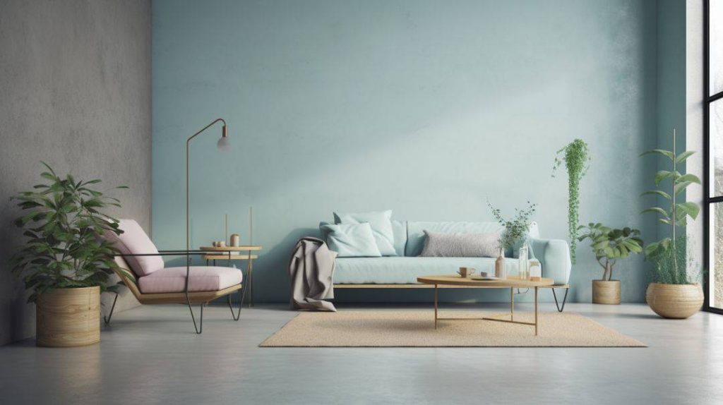
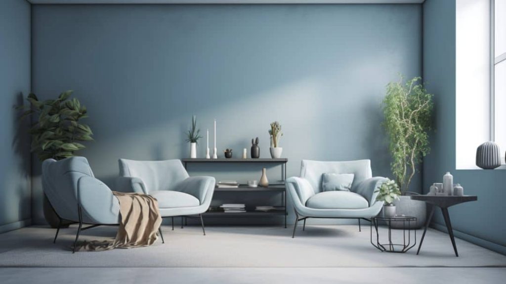
- Cool hues like blues and greens tend to be calming, while warm reds, oranges and yellows feel energizing.
- Smooth, soft textures evoke comfort and tranquility. Rough, uneven textures feel stimulating and rustic.
- Familiar textures like wood grain and fabric weaves spark nostalgia and connections to childhood.
- Novel, unexpected textures intrigue the brain and capture attention.
| Texture | Psychological Impact |
|---|---|
| Rough | Stimulating, rustic |
| Soft | Calming, comforting |
| Familiar | Nostalgic |
| Novel | Intriguing |
The direct impact on mood and emotion
- Studies measuring brain activity show colors and textures activate emotional circuitry.
- Hospital rooms painted blue lead to lowered heart rates and reduced anxiety in patients.
- Offices with warm wood textures increase employee satisfaction and productivity.
- Public spaces with novel, engaging textures like 3D wall panels see higher utilization rates.
- Texture and color choices change how people interact with and within spaces.
- Bright, smooth spaces feel sterile while muted, textured spaces feel intimate.
- Bold color and texture combinations feel lively and energizing.
The science confirms that color and texture dramatically impact human psychology, mood and behavior in designed environments. Even small tweaks to color and textures can shift how spaces make people feel on a visceral level. Getting these details right has the power to amplify positive emotions like calm, comfort, and inspiration. When designing both interior and exterior spaces, architects must carefully consider the psychological effects of each color, material, and texture selected. The smallest choices in finishes, furniture, and architectural features shape how vibrant, uplifting, and emotionally resonant a space feels. By harnessing the latest research on color psychology and tactile design, architects can create deeply nourishing environments that feel innately human-centric. From hospitals to offices to homes, color and texture choices influence the deepest aspects of the human experience within designed spaces.
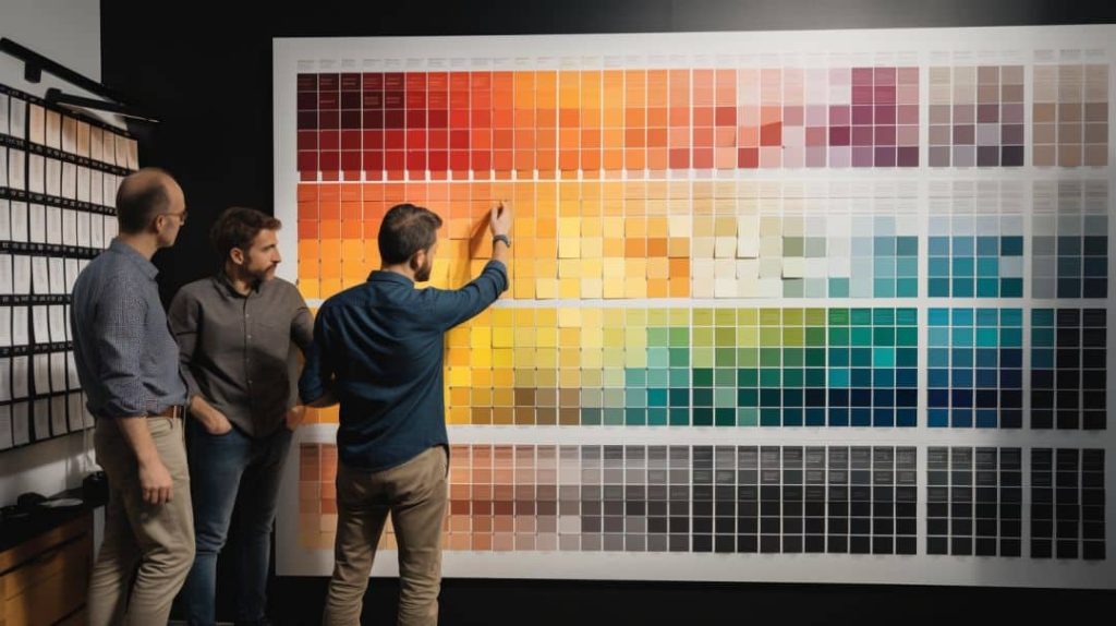
The Role of Color in Influencing Mood
Color is one of the most potent influencers of human psychology and mood. The inherent emotional qualities of different hues have an instant impact on feelings and mindsets. Skillful use of color gives architects immense power to shape the overall atmosphere of a space.
The relationship between color and emotion
- Colors elicit innate emotional and physiological reactions due to evolution.
- For instance, blue recalls serene skies and seas, activating calming responses.
- Red triggers the fight-or-flight reaction, raising pulse and respiration.
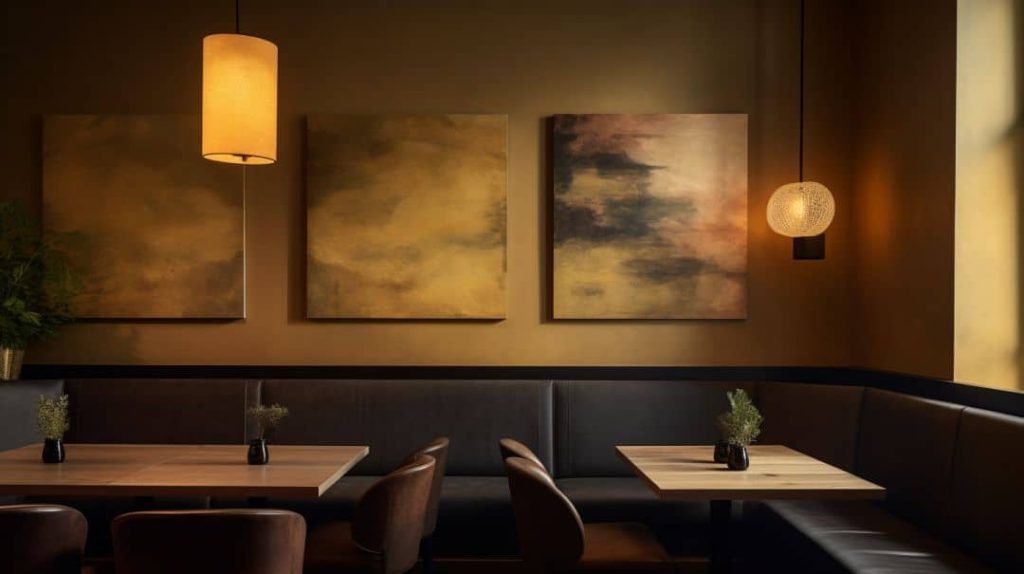
- Orange and yellow spark feelings of warmth, energy, and joy.
- Green evokes renewal and balance linked to the natural world.
- Cool tones like purple and blue seem soothing and spiritual.
- Warm earth tones like terra cotta feel grounding and stabilizing.
| Color | Emotional Impact |
|---|---|
| Blue | Calming, serene |
| Red | Exciting, energizing |
| Orange | Warm, joyful |
| Green | Renewing, balanced |
| Purple | Soothing, spiritual |
How certain hues can elicit specific responses
- Exposed concrete elicits feelings of rawness and authenticity.
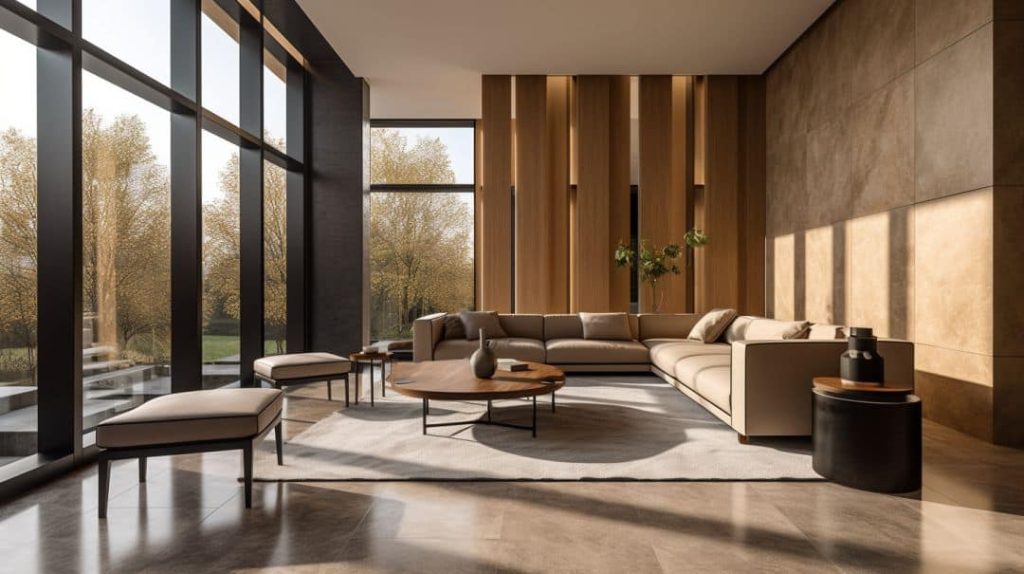
- Natural wood surfaces evoke warmth and coziness organically.
- Cool blues and greens foster relaxation in bedrooms and spas.
- Vibrant accent walls engage the mind and boost energy.
- Monochromatic taupe palettes support focus and clear thought.
- Bright primary colors stimulate creativity and imagination.
- Subtle, desaturated palettes allow architectural forms to shine.
- Contrasting color blocks define distinct spatial zones.
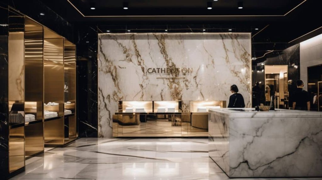
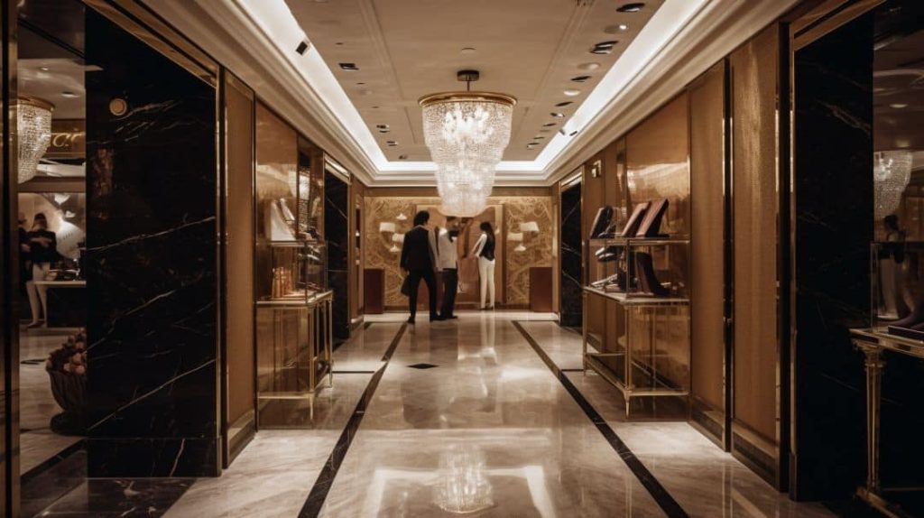
- Warm metallic finishes and textures add richness and elegance.
Thoughtful color schemes attune spaces to human needs, whether relaxation, inspiration, or productivity. The informed use of color in architecture and design creates environments that feel intrinsically supportive of people’s wellbeing. For example, a bedroom decorated in restful blues and greens promotes deep sleep and renewal, while an office accented with energizing reds and oranges boosts productivity and engagement. Public spaces come alive when dynamic color blocking and accents reflect the rhythm of human activity. Ultimately, a sensitive understanding of color psychology allows designers to craft interiors and exteriors that feel profoundly humane. The right hues speak directly to the soul, creating spaces where people can thrive emotionally and physically. Color sets the tone for how inhabitants intuitively interact with and within buildings on a visceral level.
The Power of Texture in Setting the Tone
Texture is a subtle but extremely influential element of design psychology. The tactile qualities of surfaces impart distinct emotional tones within a space. Masterful use of textures allows architects to cater environments to desired moods and activities.
The influence of texture on psychological responses
- Rough, uneven textures feel earthy, natural, and rustic.
- Smooth, polished surfaces evoke sleekness and modernity.
- Matte textures feel calm and understated.
- Glossy textures amp up energy and drama.
- Soft, lush textures induce comfort and relaxation.
- Hard, reflective textures feel lively and stimulating.
- Natural wood grain has an inherent warmth and organic quality.
- Novel, unexpected textures intrigue occupants.
- Familiar textures spark connections to memories and past experiences.
How different textures can affect mood
- Rough plaster or brick feels earthy and grounded.
- Glossy tiles lend bathrooms a sleek, clean look.
- Soft rugs and fabrics soothe and reduce stress.
- Natural wood finishes bring organic warmth.
- Concrete floors have an urban rawness.
- Leather and velvet enhance luxury.
- Weathered distressing adds rustic character.
- Mirrored and polished metals inject glamour.
- Textural contrasts create visual interest.
Thoughtfully combining and modulating textures allows for highly personalized, emotionally resonant spaces. When textures harmonize with intended activities and ambiance, interiors feel innately supportive. For example, soft textures like upholstered walls and rugs establish a cocoon-like sense of comfort in a lounge area, while slick glossy finishes and metals communicate energy in a dining room. Public spaces rely on textural contrasts to define zones and circulation paths. Overall, leveraging knowledge of texture psychology empowers architects to design environments that feel profoundly human-centric. With an array of textures at their disposal, designers can craft customized, bespoke interiors that respond to each client’s unique needs and sensibilities. From the tranquility of a bedroom to the buzz of a lobby, textures define an integral spatial language that sets the tone of every interior.
The Connection between Texture and Color Emotion
Texture and color interact to shape psychological responses to designed environments. Surface qualities actually change how the brain emotionally processes colors. Understanding this interplay allows designers to fine-tune mood and style.
Research on how texture affects color emotion
- Smooth, matte textures amplify the inherent emotional qualities of colors.
- Glossy, reflective textures mute color emotion and seem more energetic.
- Warm wood grain adds coziness to any color palette.
- Concrete, plaster, and stone add earthiness to colors.
- Fabrics soften colors for a comforting, tranquil effect.
- Metallics imbue colors with luxurious, elegant associations.
- Pairing cool hues with smooth textures maximizes relaxation.
- Warm hues feel more dramatic and celebratory on glossy textures.
The impact of texture and color in visual art
- Impressionist painters used visible brushwork to energize colors.
- Pointillism relied on canvas texture contrasting with dots.
- Fauvists heightened color emotion through matte textures.
- Abstract artists like Pollack exploited texture as content.
- Rothko’s matte color fields provoke meditation.
- Street artists use gritty urban textures as canvas.
- Graphic designers apply principles in posters and branding.
- Textile designers master texture/color interplay.
- Interactive media incorporates tactile qualities.
Thoughtful manipulation of textures allows designers to unlock the full depth of color possibilities. By artfully harmonizing textures and hues, artists and designers gain immense power to elicit targeted psychological and emotional responses. For example, coupling the inherent coziness of natural wood with warm sunset tones creates an especially inviting, familiar atmosphere. Alternatively, combining glossy surfaces with bold, dramatic colors amplifies their energy and celebratory spirit. The pairing of texture and color offers a nuanced visual language for establishing highly specific moods. Whether seeking to inspire reflection, spark joy, or boost motivation, designers can leverage this relationship to imbue spaces with qualities that speak directly to the human experience. With a mastery of texture/color interplay, artists and architects create environments that feel profoundly multi-sensory, immersive, and emotionally resonant. Texture gives color a deeper vocabulary for articulating the poetry of space.
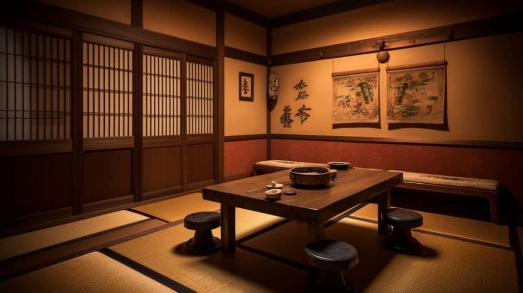
Cultural Influences on Color and Texture Perception
While color and texture evoke innate biological reactions, cultural background also shapes emotional responses. Architects must consider how color and texture associations vary cross-culturally.
The role of cultural background in color and texture preferences
- Cool tones suit Japanese minimalism while warm tones match Brazilian exuberance.
- Natural textures resonate in the Pacific Northwest more than the Southwest.
- White walls support Scandinavian restraint while colorful murals match Latin passion.
- Traditional textures like shoji screens hold meaning in Japan.
- Adobe architecture ties into Native American history.
- Ornate decorative molding suits French luxury.
- Grasscloth and bamboo have significance in Asia.
- Glass and steel reflect Bauhaus principles.
- Rustic barnboard has American pastoral associations.
- Arabian architecture values intricate ornamentation.
Cross-cultural studies on color emotion
- Red means luck in China but danger in the US.
- White symbolizes purity in the West but death in Asia.
- Blue elicits sadness in China and stability in Western cultures.
- Yellow stimulates the appetite in the US but signals prestige in Spain.
- Green represents fertility in Egypt but criminality in France.
- Saffron invokes spirituality in India, while purple connotes royalty in Europe.
- Turquoise has magical meaning to some Native Americans.

Understanding cultural context ensures colors and textures transfer the right meanings. By considering traditional associations as well as evolving tastes, architects can integrate color and texture in ways that resonate authentically. For example, incorporating familiar, locally sourced wood finishes ties into regional pride in the Pacific Northwest, while abstract metalwork reflects China’s contemporary identity. Adapting international styles to local cultural narratives, through thoughtful color and texture selection, allows designs to feel genuinely rooted in place and community. In our increasingly globalized world, sensitivity to cross-cultural perspectives on color and texture nuances the psychological specificity of designed environments. With insight into diverse cultural outlooks, architects can create spaces that speak to the unique spirit of each locale.
Incorporating Textures in Architectural Design
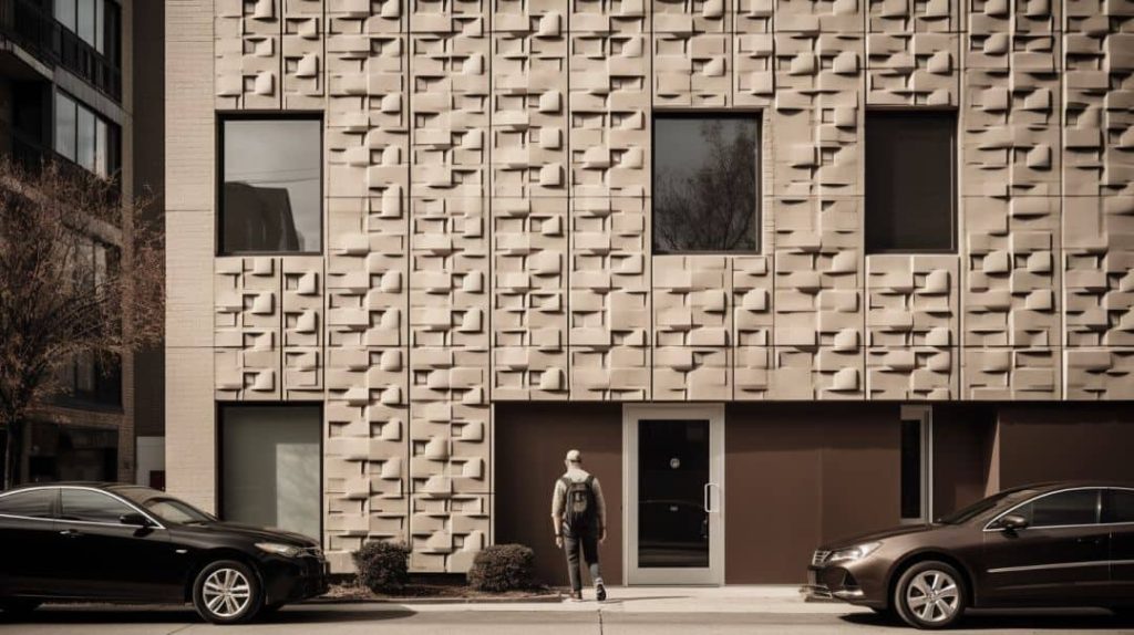
Texture is a foundational architectural element for shaping occupant experiences. The masterful use of texture allows designers to curate emotional and psychological responses through built environments.
How architects use texture to create emotional responses
- Rough natural stone textures lend strength and timelessness.
- Smooth plaster soothes and shelters occupants.
- Reflective metals and glass connote future-facing dynamism.
- Tactile wood evokes innate human warmth.
- Weathered patinas add nostalgic character over time.
- Luxurious velvet and leather enrich special spaces.
- Coarse concrete communicates raw authenticity.
- Soft mosses and ivy infuse living textures.
- Flowing water features add calming natural textures.
- Distressed metals and woods add vintage appeal.
Examples of texture in parametric design
- Unconventional textures produced through digital fabrication and parametric modeling expand architectural possibilities.
- 3D printing crafts textures at any scale like bionic patterns.
- Computer numeric control (CNC) carves biophilic textures from wood.
- Parametric software generates expressive liquid metal textures.
- Laser cutting produces intricate perforated and cellular textures.
- Algorithmic processes create fractal textures with mathematical precision.
- Scanned surface images get transferred onto wall panels.
- Found object impressions are molded into concrete.
The philosophy of Ebenezer Howard and its influence on architecture
- Howard pioneered the “garden city” concept blending nature and urban life through texture.
- He advocated for human-centric suburban design harmonizing city and country.
- The garden city philosophy made vegetation, living textures integral to communities.
- This influenced tactical urbanism and landscape urbanism movements.
- Howard’s emphasis on nature’s textures shaped countless suburbs and new towns.
- The garden city movement made urban living more texturally organic and livable.
- Howard’s vision defined the DNA of textures in human-centered design.
Thoughtfully incorporating texture is foundational to emotional and biophilic design. By harnessing the psychological power of tactile qualities, architects create spaces that viscerally nurture the human spirit. Flowing water, weathered wood, and fieldstone masonry impart a tangible sense of being rooted in nature’s rhythms and wisdom. At the same time, parametric textures on printed metal panels and interactive surfaces reflect our society’s dynamic technological evolution. Masterful texture use weaves messages of humanity’s emotional needs and future possibilities into the built environment. When textures artfully attune spaces to both timeless nature and contemporary technology, architecture transcends functionalism to become a sensually emotive cultural statement. As Ebenezer Howard contended, the right textures beckon city dwellers’ intrinsic longing for biophilic balance and emotional authenticity. By speaking this timeless natural language, textures inscribe deep human poetry into every designed environment.
The Intersection of Textures and Emotions in Art
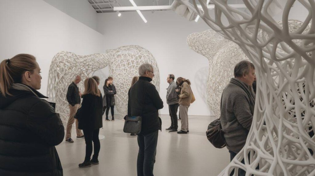
Artists have long harnessed texture as an emotive device beyond just canvas paintings. Installation art and environmental works use scale, setting and tactile qualities to immerse viewers and amplify emotional impact.
The use of texture in outdoor installations and land art
- Andy Goldsworthy uses natural textures like stone, wood, and ice in ephemeral outdoor sculptures evoking growth, decay, and the passage of time. The textures provoke contemplation of human impermanence against nature’s cycles.
- Christo and Jeanne-Claude’s wrapped public buildings and landscapes played with tantalizing textures like draped fabric to awaken a sense of majesty in everyday environments.
- Isamu Noguchi’s sculptural playgrounds were tactile, hands-on environments using textures like rough stone that restored a childlike sense of joyful play.
- Robert Smithson’s monumental earthworks like Spiral Jetty used primordial textures to connect viewers to the timelessness of geological change.
- Texture became paramount in experiential artist environments like Nancy Holt’s Sun Tunnels and James Turrell’s Roden Crater.
How textures can evoke emotions beyond the gallery space
- Public art textures can humanize urban architecture’s coldness with warmth, whimsy, and intrigue.
- Organic and recycled textures send a sustainable message about humanity’s connection to nature.
- Interactive or participatory textures engage people creatively and socially in public spaces.
- Futuristic, alien textures represent society’s imaginative outlook and technological future.
- Nostalgic vintage textures speak to our memories, longings, and need for authenticity.
- Biophilic textures replenish our bonds to the natural world.
Thoughtfully incorporating art’s textures creates emotionally meaningful narratives within our shared public spaces. Beyond formal museums, public art that cleverly engages environmental textures possesses unparalleled power to connect communities through a universally shared language of touch. Whether abstract or figurative, art rooted in tangible textures speaks directly to our innate senses. A living wall of plants whispers nature’s quiet wisdom, while redistributed asphalt hunks make us smile at our urban landscape in a new way. By masterfully harnessing scale, setting and tactility, public art textures awaken awe, joy, and a poignant sense of shared humanity within cityscapes. Through the profound emotional vocabulary of materials like wood, stone and soil, public art etches poetic reminders of our authentic bonds to this world and one another into the very surfaces of our manmade terrain. With insightful artistry, environmental textures become brushstrokes that re-enchant urban life with nuanced stories about who we are.
Practical Applications of Color and Texture in Design
The psychology of color and texture has many practical applications for architects, builders, and homeowners seeking to enhance spaces on a budget.
Tips and tricks for choosing the right textures for signage
- Rough cedar plank signage adds organic warmth against exterior stucco.
- Backlit displays gain drama from sleek high-gloss acrylic panels.
- Distressed metal signage adds vintage charm to brick walls.
- Concrete/stone textures match earthy natural EIFS finishes.
- Weathered wood signs complement timber and walnut EIFS accents.
- Fabric printed signs offer affordable tactile interest.
- Mimicking façade textures creates cohesive custom signage.
Budget-friendly interior design tips
- Paint walls bold colors for high-impact and inexpensive vibrancy.
- Use wallpaper or murals to incorporate exciting new textures.
- Add tactile pillows, throws, and carpets as textural accents.
- Display collections of natural objects like shells or stones.
- Replace cabinet hardware with metal/wood knobs for textural interest.
- Arrange houseplants with assorted leaf shapes and sizes.
- Group found items like nets, ropes, or fishing floats in wall art.
- Showcase handmade pottery, weavings, or wood carvings from local artisans.
With creative texture and color use, inexpensive design upgrades unlock neglected sensory dimensions within any home. By tapping into color psychology and tactile design thinking, small affordable additions breathe new life into existing walls, floors and furnishings. For example, painting a bold accent wall or displaying collected natural artifacts makes residents and visitors experience familiar rooms in a refreshing new light. Using textiles in unlikely ways — like upholstering a chair in corduroy — invites the sense of touch into play. With an experimental yet thoughtful approach, subtle texture and color moves activate untapped senses to make any interior feel more multi-dimensional and emotionally resonant. Uncovering this unseen sensory potential demonstrates that enhancing our most direct experience of built spaces need not rely on costly materials. With an imaginative spirit and comprehension of color and texture’s emotional powers, impactful sensory enrichment is available at every budget level.
Conclusion
Color and texture hold remarkable power to shape human experience within designed environments. Subtle qualities like texture, sheen, and hue speak directly to our senses, eliciting deep emotional and psychological responses. Research confirms that our brains instantly process and associate colors and textures with distinct moods and meanings.
Skillful application of this knowledge allows architects to craft deeply personalized, human-centric spaces. Warm wood tones or cool blue hues are selected to nourish desired activities and mindsets. Public spaces come alive with invigorating textural contrasts and accents that reflect human energy. Over time, the inherent nostalgia and organic quality of finishes like natural timber add character and charm.
With globalization, designing for diverse cultural color symbolism and texture traditions fosters authenticity. But while associations vary, materials like stone, water, and plants retain innate expressive powers. Ebenezer Howard manifested this biophilic connection pioneering the “garden city” philosophy.
Beyond buildings, artists amplify texture’s emotional potency within installations and public art. EIFS (exterior insulation and finish systems) offer similar capacities to infuse built environments with sensorial richness. With endless finish options from sandstone to metal, EIFS allows designers to curate psychological experiences through color and texture.
Tactile design thinking and scientific research on color psychology empower architects to create one-of-a-kind spaces that feel profoundly human-centric, nourishing, and soulful. By leveraging the emotive and symbolic power of materials, light, and form, designers can craft exterior spaces that uplift the human spirit. From schools to hospitals to homes, attentiveness to color and texture nuance provides architects a powerful tool for shaping the emotional essence of inhabited environments.
FAQs
How do colors and textures impact human psychology?
Research shows colors and textures elicit specific emotional and physiological responses in the brain’s limbic system linked to mood, memory and behavior.
Can colors and textures improve mental health?
Yes, designing spaces with colors and textures that reduce stress and lift mood has measurable benefits for mental health.
How do I choose exterior colors and textures for my home remodel?
Consider how different hues make you feel and experiment with tactile finishes like wood or stone that add personality. Consult an EIFS professional for recommendations.
What are some advantages of EIFS textures vs other exteriors?
EIFS offers immense flexibility for customized textures that can establish a unique aesthetic. EIFS acrylic finishes also maintain durability and vibrancy longer than many alternatives.
How do I create an inspiring workplace using textures?
Stimulating textures like recycled materials and living walls boost morale. Softer, more muted textures help concentration in focused work areas.

One Comment
[…] Texture, light, and scale work together to create rooms that feel not just livable, but exceptional. Studies have shown that tactile stimulation can influence emotional states and enhance user experience in built environments. Learn more about how color and texture affect mood and perception. […]